- Trading
- Trading
- Markets
- Markets
- Products
- Forex
- Commodities
- Metals
- Indices
- Shares
- Cryptocurrencies
- Treasuries
- ETFs
- Accounts
- Accounts
- Compare our accounts
- Our spreads
- Funding & withdrawals
- Open account
- Try free demo
- Platforms & tools
- Platforms & tools
- Platforms
- Platforms
- Platforms overview
- TradingView
- MetaTrader 4
- MetaTrader 5
- Mobile trading platforms
- Premium trading tools
- Premium trading tools
- Tools overview
- VPS
- Genesis
- Education
- Education
- Resources
- Resources
- News & analysis
- Education hub
- Economic calendar
- Earnings announcements
- Help & support
- Help & support
- About
- About
- About GO Markets.
- Our awards
- Sponsorships
- Client support
- Client support
- Contact us
- FAQs
- Quick support
- Holiday trading hours
- Maintenance schedule
- Fraud and scam awareness
- Legal documents
- Trading
- Trading
- Markets
- Markets
- Products
- Forex
- Commodities
- Metals
- Indices
- Shares
- Cryptocurrencies
- Treasuries
- ETFs
- Accounts
- Accounts
- Compare our accounts
- Our spreads
- Funding & withdrawals
- Open account
- Try free demo
- Platforms & tools
- Platforms & tools
- Platforms
- Platforms
- Platforms overview
- TradingView
- MetaTrader 4
- MetaTrader 5
- Mobile trading platforms
- Premium trading tools
- Premium trading tools
- Tools overview
- VPS
- Genesis
- Education
- Education
- Resources
- Resources
- News & analysis
- Education hub
- Economic calendar
- Earnings announcements
- Help & support
- Help & support
- About
- About
- About GO Markets.
- Our awards
- Sponsorships
- Client support
- Client support
- Contact us
- FAQs
- Quick support
- Holiday trading hours
- Maintenance schedule
- Fraud and scam awareness
- Legal documents
- Home
- News & Analysis
- Trading Strategies, Psychology
- Top Candlestick Patterns and How to Use them in Your Trading
- Home
- News & Analysis
- Trading Strategies, Psychology
- Top Candlestick Patterns and How to Use them in Your Trading
 News & AnalysisNews & Analysis
Candlestick charts are one of the most popular and commonly used tools by traders in analysing the markets. In this article, we will briefly look at its history then move on to some basics on how to interpret these charts. We will also look at some of the major candlestick chart patterns to give you an understanding of how you can use them for your trading analysis.
A brief history of candlestick charts
Candlestick charts originated in Japan in the 18th century and is one of the earliest known forms of technical analysis. Today, it is the most popular chart used by FX traders as it provides a quick and easy picture of price action in a particular trading session.
Analysing and understanding a candlestick
A candle is made up of a rectangular ‘body’ and single lines at both ends called ‘wicks’. Candlesticks provide a more visual representation of price action than you get from simple Bar or Line charts. For the purpose of this article, the bear (down) candle will be red, and a bull (up) candle will be blue. One candle will represent one whole trading day. However, it is important to note that with the MT4 platform you can also set up the candlestick chart to reflect 1 min, 5 min, 15 min, 30 min, 1 hour, 4 hour, daily, weekly and monthly time frames.
Candlestick body represents strength of price action
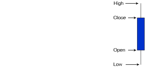
As per the diagram below, the formation of a candlestick represents the open, high, low and close price for the day.

The length of the body shows the strength of the price action. The longer the body of a candlestick, the stronger or more aggressive the price action is. In the example below shows two similar size candles, however, the second one is a stronger bullish candle as the body is longer.

Wicks represent buyer and seller activities
The thin lines above and below the body are called ‘wicks’ and represent the high and low range of the price for the day. The wick on top of the body represents sellers and selling activity. The bottom wick indicates the presence of buyers and buying activity. The length of the wick gives a good indication of the strength of the type of activity i.e. a longer wick is more definitive than a shorter one.
A long upper wick and short lower wick indicates that there were buyers earlier in the day pushing prices higher. However, strong sellers later on in the session forced the prices down from their highs, creating a long upper wick.
A long lower wick and short higher wick indicates that sellers dominated earlier in the day, however, stronger buyers entered later in the session pushing the prices higher from their lows and creating a long lower wick.

Common Candlestick chart formations
Here are some of the most common candlestick chart formations that FX traders use for their trading analysis.
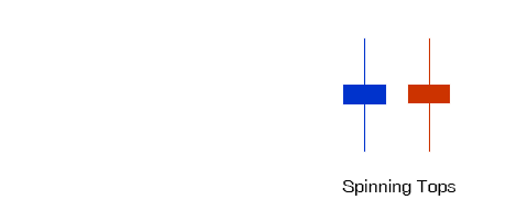
Spinning Tops
A Spinning Top is a Candlestick with a short body and a long upper and lower wick. It indicates uncertainty in the market and puts a question over which way prices may be heading. The long wicks indicate strong buying and selling activities at some stage during the trading session, but with no clear winner at the end.
If a Spinning Top occurs towards the end of a trend it may indicate that the trend is coming to an end. If it occurs while the market is moving sideways, it may indicate a start of a trend. A Spinning Top is usually a Neutral signal.

Doji
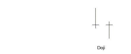
A Doji candlestick is formed when the opening price is the same or very close to the closing price. It signals a balance between buyers and sellers.
A Doji with a long upper wick indicates the initial presence of buyers. The price has initially moved higher and eventually attracted sellers. In this case, the sellers are seen as the stronger group, as they closed out the day.
A Doji with long lower wick indicates the initial presence of sellers. The lower prices attracted buyers, who ended up being the stronger group as they closed out the trading session.

Looking at a Doji on its own may not give a clear buy or sell signal. But looking at it and taking into consideration preceding candles, it can provide some valuable information.
For example, if a Doji occurs at the end of a trend or even one trading session, it may be a sign that a potential change in direction may happen. It might also occur at the end of a congestion phase. It might follow an up candle or a down candle. The strength of the previous candle, as measured by the length of the real body, will give traders an idea on how to interpret the Doji signal.
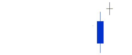
In the diagram below, a Doji appears after a relatively bullish session. This can either indicate a start of a new phase of the uptrend (if a trend exists), or a potential change into a new (bearish) direction.

Gravestone Doji
It is a reversal pattern that could mean a bullish rally is about to end. This is formed when the open, low and close are equal and the high creates a long upper wick. The resulting candlestick looks like an inverted “T”.
A Gravestone Doji indicates that buyers dominated trading and drove prices higher during the early part of the session. However, by the end of the trading day, sellers started to appear and pushed prices back to the opening level and the session low. A Gravestone Doji is usually a bearish signal.

Dragonfly Doji
This Doji formation is another signal of indecision between buyers and sellers. A Dragonfly Doji is formed when the open, high and close are equal and the low creates a long lower shadow. The resulting candlestick looks like a “T”.
A Dragonfly Doji indicates that sellers dominated early trading and drove prices lower during the session. But by the end of the session, buyers appeared and drove prices back to the opening level and the session high. A Dragonfly Doji is usually a bullish signal.

Harami
A Harami is a reversal pattern and consists of two candlesticks. A Harami formation can be bullish or bearish depending on the direction of the price action. The most important thing to consider when looking for a Harami is the gap up and gap down in price.
A bearish Harami is formed when a large bullish candle (Day 1) is followed by a small bearish or bullish candle (Day 2) which showed a gap down in price.
A bullish Harami occurs when a large bearish candle (Day1) is followed by a small bearish or bullish candle that showed a gap up in price.
The important thing to consider is the size of the body of both candles as it is indicative of the strength of the signal. The first candle should have a rather large body. The smaller the body in the second candle the stronger the signal. Example of a Bearish Harami:

Hammer
A Hammer is a bullish reversal pattern usually formed at the end of a declining price trend. It is identified by its small body at the higher side of the range. The bottom wick should be at least twice the size of the real body and the upper wick should only be small, if it exists at all.
In chart analysis, it is the length of the wick (of a Hammer formation) relative to the body that creates the signal. The wick could be viewed as a sign of rejection of lower prices and therefore a possible reversal of the trend.

Hanging Man
A Hanging Man is a bearish reversal pattern. Its formation is similar to the hammer formation, except that it occurs at the end of a bullish trend. Once again the body is at the top of the range with the lower wick at least twice as long as the body. The upper wick should be short if it can be found at all. It is best to seek confirmation of a bearish reversal with a follow-up signal the next day.

These are just some of the basic candlestick patterns. There are numerous books and online resources available about Candlestick charting. If you you’re new to FX trading, it would be highly recommended to read up on Candlestick charts to find out how you can use it for your trading.
Ready to start trading?
Disclaimer: Articles are from GO Markets analysts and contributors and are based on their independent analysis or personal experiences. Views, opinions or trading styles expressed are their own, and should not be taken as either representative of or shared by GO Markets. Advice, if any, is of a ‘general’ nature and not based on your personal objectives, financial situation or needs. Consider how appropriate the advice, if any, is to your objectives, financial situation and needs, before acting on the advice.
Next Article
JPY sees a wild trading session
Upcoming News » 10:30pm GDP - CAD » 10:30pm Advance GDP - USD » Sat 6:00am EBA Bank Stress Test Results - EUR, USD, JPY The JPY saw a wild trading session today as the BOJ boosts dollar lending and ETF purchases. Interest rates to be kept steady at this point. We found out on Wednesday the amount of the stimulus package. This weekend ...
July 29, 2016Read More >Previous Article
Why Brexit is Not a Black Swan
The 7.95% downward move on the British Pound (GBP) on the back of the Brexit vote was definitely one of a kind. The black line in the chart below sho...
July 28, 2016Read More >Please share your location to continue.
Check our help guide for more info.

